smart beta

Huygens derivative market stress indicator helps protect against trade war related volatility bursts

In 2019 the volatility environment for our active derivatives portfolios (also known as our ‘short volatility’ portfolios) has rotated between two states:

  • Benign volatility as the U.S. economy continues to defy recession expectations and churns out steady, moderate growth - a very good scenario for harvesting volatility risk premium the way we do.

  • Bursts of volatility as surprise escalations of the U.S. - China trade war inject uncertainty into expectations for the future of the economy - a scenario which can quickly cause our derivative market stress indicator to turn bearish and wait for the volatility environment to improve.

In a previous post we described the gains our portfolios delivered in early 2019, after our derivative market stress indicator turned bullish in late January. The first of 2019’s surprise China trade war escalations came in May and hurt returns in that month before causing our portfolios to turn bearish until late June.

In June, volatility turned benign again and our portfolios were back to bullish and harvesting volatility risk premium. Then on July 31st, the U.S. Federal Reserve lowered interest rates as well as terminated early its balance sheet reduction program, known as quantitative tightening. The announcement linked the moves to providing the U.S. economy ‘insurance’ against future uncertainty, and this was generally interpreted as being linked to the ongoing U.S. - China trade war.

U.S. equity investors didn’t take the news well that day, perhaps anticipating that this would give the U.S. administration the green light to escalate the trade war. Our indicator turned bearish as a result, and our active derivatives portfolios exited the short volatility position at market close on August 1st.

That same day, the U.S. did indeed escalate the trade war with an announcement of new tariffs, and over the weekend China immediately responded by halting U.S. agricultural purchases and devaluing its currency. This drove a further volatility burst on Monday August 5th.

The below charts show the two short volatility indices that our active derivatives portfolios trade. When our portfolios are in the bullish positioning, they gain in value as these indices increase in value. On these charts we point out the days on which the trade war escalations were announced. The color coding of the lines also shows what was the state of our derivative market stress indicator at the time.

Mid-term volatility ETF (ticker: ZIV) traded by our robo-advisor active derivative portfolios

Signal vs ZIV ETF.png


Short-term short volatility index traded by our Titan and Sidereal short volatility portfolios

Signal vs Short Vol Index.png


At the moment, our indicator remains bearish, and due to its design will remain in that state for at least several more days.

One final observation - the early termination of the Federal Reserve’s quantitative tightening program could be quite significant and positive for the U.S. economy, stocks, and the volatility regime. Read here for our analysis of the impact quantitative easing and tightening have had on stocks.


How have our active equity portfolios performed over the past 9 months of stock market volatility? Quite well...

The first half of 2019 is a typical example of how our active portfolios can protect investors from behavioral biases that keep them from capturing stocks’ gains. 

Recall the situation coming into the year. During the brutal selloff of 2018’s 4th quarter, the Huygens equity market stress indicator was bearish for 54% of the trading days. All the financial news was bad. It was frightening:

Given the turmoil, investors might have been tempted to exit all stock exposure to wait for clear signs that the economy has strengthened before getting back in. 

Anyone doing that in 2019 missed a remarkable run and instead just locked in losses.  The signs of strength didn’t come until after most of the gains had been earned – as is usually the case. In January, there was no all-clear signal in the news as headlines stayed bleak:

Even so, the S&P 500 gained +7.9% in January.  The Huygens equity market stress indicator turned bullish within the first 5 trading days of the year, and as a result the most conservative Huygens active equity portfolio gained +3.7% while the most aggressive gained +5.6%.

In the months of February thru April 2019, economic news was mixed. An investor seeking unequivocal evidence of a strengthening economy still didn’t get it during these months, but equities kept recovering.  The S&P 500 gained 8.9% from February through April, and because our equity market stress indicator stayed bullish throughout, our conservative active equity portfolio was up 5.0% and our most aggressive was up 6.7% in the same period.

Then came May.  Headlines in the early part of the month finally made it clear that the previously expected 2019 recession had been averted:

But by the end of the month, news had turned sour again:

And the S&P 500 fell -6.6% in the month.  Our active equity portfolio composition protected against much of these losses: our conservative portfolio clients lost only -0.5%, while those in our aggressive portfolio lost only -2.1%.

Once again, an investor might have taken May’s selloff as a sign the economy was really faltering this time, and again this would have been a mistake. Our equity market stress indicator stayed bullish throughout, positioning our active portfolios to capitalize on the gains that were to come in June as the S&P 500 established a new high.

The industry-standard way to assess the benefits of an active strategy such as ours is a metric called “capture.” Up-capture measures how much of an index’s gains our strategy delivered, and down-capture measures how much of that index’s losses our strategy gave up.

The below table shows that over the past nine months (Oct 2018 thru Jun 2019) of heightened stock market volatility, all three of our active equity portfolios delivered much more of the upside than the downside of the equity indices they actively trade (click here for comprehensive performance tables and index descriptions):

*Past performance is not necessarily indicative of future results

*Past performance is not necessarily indicative of future results

Enhancing our active equity portfolios: Bye bye small cap stocks, hello momentum stocks

Starting April 1st of this year, we replaced US small cap stock exposure in our active equities portfolios with US momentum stock exposure. We did this because small, fast-growing, vibrant companies are choosing to stay privately owned rather than publicly listing their shares. In addition, internet business models have created a “winner-take-all” dynamic in many segments of the economy. As a result, we believe momentum stock exposure is better than small company stock exposure for capturing returns during periods of low stock market stress. More details below.


MTUM IWM SPY.png


Exploiting equity factors to capture maximum risk-adjusted returns for our clients is a core element of our investment approach.  You can read more here on how we use factors in our portfolios.

We originally designed our active equity portfolios to seek small cap US equity exposure via the Russell 2000 index ETF (IWM) in times of low equity market stress, as determined by our equity market stress indicator.

The relative outperformance of smaller companies over many decades has been heavily studied in the investing industry literature, and it has been generally attributed to small companies’ better growth opportunities combined with their comparative obscurity. If fewer investors have researched these companies, the rationale goes, there is better opportunity for a smart investor to buy their shares at a good price before other investors catch on.

Over the past few years, the strength of the small cap factor has been shown to be weakening - this Research Affiliates study and this Wall Street Journal article both give a nice overview.

Moreover, the U.S. equity market has changed dramatically in the past decade, and one of the biggest changes has been the shrinking population of publicly-traded small-cap companies - read more on that in this Vanguard research note. There are still plenty of small companies, they’re just not going public anymore to fund their growth - read more on that here. Instead, they’re choosing to stay privately held because they’re finding it easier to raise financing in the ever-expanding private capital market, as described in this McKinsey report. For an excellent first-hand account of this phenomenon, read “Why so few of our companies aspire to go public” by SSM Partners, a growth private equity firm focused on smaller companies.

In addition, the winner-take-all dynamic driven by companies like Amazon, Google, Netflix, and other internet-centric businesses, described in this New Yorker article, means that growth is accruing to fewer and fewer of the remaining publicly-traded companies. This dynamic favors ‘momentum’ companies – those whose recent stock price performance has been better than average.

The above chart shows how big the performance difference has been between small cap stocks and momentum stocks. In the past 5 years, the MSCI momentum stock index ETF (MTUM) has delivered nearly 2x the return of the broad S&P 500 index ETF, and nearly 3x the return of the Russell 2000 small cap index ETF.

Momentum companies’ outperformance relative to the broader population of publicly traded companies isn’t a new phenomenon. MSCI publishes the US momentum stock index that our portfolios use via the MTUM ETF, and their research shows this to have been true for decades. But momentum’s outperformance relative to small caps is stronger than ever, and we believe this will persist into the future.

Derivative market stress abated in first 5 months of 2019, driving gains for short volatility investors

Back in 2018, US market equity market volatility caused our derivative market stress indicator to signal bearish positioning for 61% of the year. For a quick reminder of what was behind 2018’s volatility, take a look at this post. This means that our dynamic derivatives clients’ assets spent most of 2018 in cash or 10-year US treasuries, waiting patiently and safely for better opportunities to emerge.

The first 5 months of 2019 has shaped up to be a time of better opportunities. As the recession scare of Q4 2018 wore off, subdued volatility in equity and derivative markets has driven our derivative market stress indicator to signal bullish positioning for 66% of this year, through the month of May. The difference in short volatility conditions, and in the positioning of our indicator, is evident in the chart below.

*Past performance is not necessarily indicative of future results

*Past performance is not necessarily indicative of future results

Early May saw a surprising return of volatility - surprising because after months of headlines signaling positive developments in international trade negotiations with China, over the May 4th-5th weekend the US announced that the tariffs against Chinese imports would be levied after all, and that negotiations were headed nowhere. Our derivatives market stress indicator quickly turned bearish, and as a result our dynamic derivatives clients spent the rest of May in cash or US treasuries (depending on the strategy).

Government stimulus drove almost all of past 10 years’ S&P 500 gains

You’ve probably seen a chart like this one, showing the striking relationship of the S&P 500’s gains in the past decade to Federal Reserve stimulus phases 1, 2, and 3, known as ‘quantitative easing.’ But perhaps you’ve wondered if that relationship is just a coincidence.

Well, the fourth quarter of 2018 made clear it’s no coincidence.

S&P 500 and Fed Bal Sheet over time.png

We’ve marked periods on the above chart as easing, pause, and tightening, corresponding to whether the Federal Reserve was putting money into the economy, standing pat, or taking money out. Note we’ve also marked the ‘Tax Stimulus’ period, in which government economic stimulus was being applied, but not by the Fed.

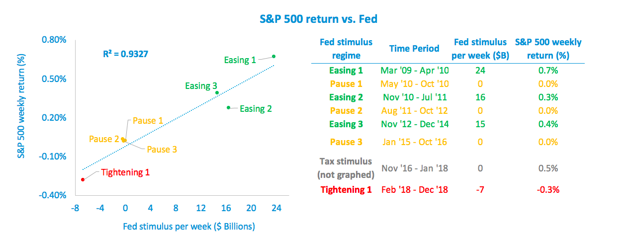
Then we graphed these periods by average S&P 500 weekly return in each period vs. the amount of money each week the Fed injected into (or took out of) the economy in that same period, and ran a regression.

S&P 500 vs Fed Stimulus.png

What’s clear is that Federal Reserve stimulus drove most of the S&P 500’s gains over the past 10 years, and tax cut stimulus drove the rest. With an R-squared of 93%, data scientists call this sort of relationship a slam dunk. Rarely is such correlation between cause and effect found in the real world.

Now that the Federal Reserve is unwinding its balance sheet and is reluctant to lower interest rates, what does this mean? Sustainable gains in equities are becoming more elusive, and protecting against volatility will be critical.


Derivative market stress indicator protects our dynamic derivatives clients from much of 4th quarter 2018 volatility

The short volatility asset class generally experiences its best returns when the outlook for US stocks is improving or static, as occurred in 2017 with a rebound in GDP growth and the passage of the Trump federal tax break (click here to read more about that in a previous post).  

It generally experiences its worst returns when the outlook for US stocks is deteriorating, as occurred in Q1 2018 with trade war talk coinciding with the arrival of a new hawkish Federal Reserve chairman, worrying investors that inflation and tight money might all be coming quickly (click here to read more about that in a previous post).

It happened again more severely in the 4th quarter of 2018. While headlines were focusing on investor fears of recession, we think the real driver of stock market volatility was the unwinding of the Federal Reserve's balance sheet (click here to see the analysis we later shared on this point).

The chart below shows how our derivative market stress indicator helped our dynamic derivatives portfolios avoid most of the 4th quarter’s volatility. Our Titan strategy avoided more than 2/3 of the short volatility index’s decline.

*Past performance is not necessarily indicative of future results

*Past performance is not necessarily indicative of future results